Connect with Coralie Gordon on LinkedIn
Telling a good story takes skill. In traditional storytelling, there are common components that make stories work – a solid opening, good characters, a problem and a solution. In the same way, there are ways to tell good stories with data. Data storytelling is about communicating data insights to your audience in a way that influences them; data storytelling gives your data a voice.
A data story could be conveyed in a chart, infographic, dashboard or even a video. But regardless of the medium, it should have three components: data, visuals and narrative. The key to effective data storytelling, and often most overlooked, is a compelling narrative. A compelling narrative works to engage the audience with the content and create a memorable impression.
Consider Minard's visualization of Napoleon's 1812 march:
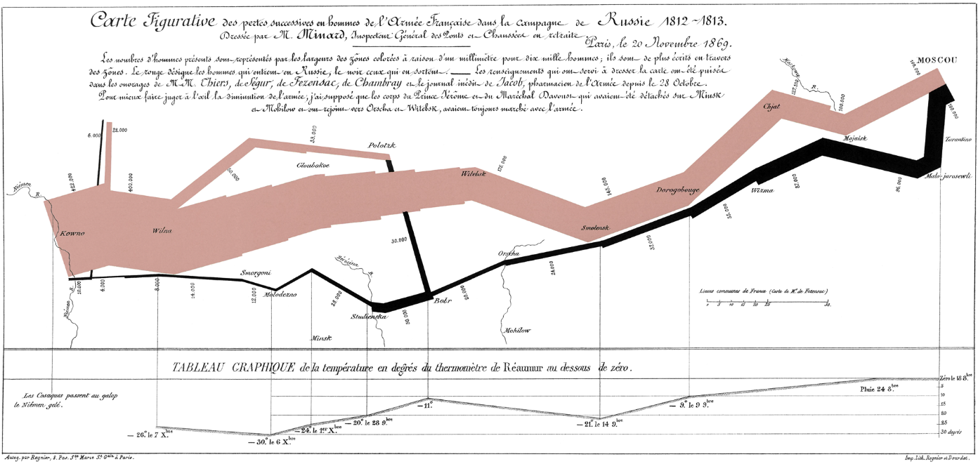
This incredible visualisation cleverly depicts the winter 1842 march of Napoleon's army to invade Russia. It has the three essential elements of a good data story; data, narrative and visuals.
The data used to produce this story is remarkably simple:
- size of Napoleon’s army by location
- temperature experienced by Napoleon's army by location during their retreat.
The narrative of the march is clear:
- Napoleon sets out from France to invade Russia with a 400,000 strong army
- the army reduces in size by the time they reach Moscow and they retreat
- by this time winter has really set in; it’s cold and it keeps getting colder
- a fraction of the original army returns to France, defeated.
The overall visualisation is a combination of three well known data graphics:
- a map displaying Napoleon's journey between France and Moscow (and back)
- an area graph showing the relative size of Napoleon's army at different locations
- a line graph showing the temperature experienced by the army during their retreat.
The way the elements of geography, army size, advance, retreat and temperature are combined and presented in the visualisation is what makes it such an effective data story.
What are some of the best examples you have seen with see data storytelling?
Send them through to the Data.NSW here.